
7 Status Page Examples That Build Customer Trust (And What They Do Right)
Explore 7 status page examples and the trust-building patterns behind them, from incident updates to a branded status page customers can rely on daily.
7 Status Page Examples That Build Customer Trust (and Patterns for Your Branded Status Page)
The status page examples people trust most aren't necessarily the prettiest ones. They're the most honest and specific. GitHub, Slack, Cloudflare, Stripe, Atlassian, Zoom, and Basecamp all do this differently, but they share the same instincts: show real-time status clearly, keep an accessible history of past incidents, let people subscribe in their own way, and write incident updates like a human wrote them, not legal counsel.
Below are seven real status page examples, broken down into the exact design and copywriting patterns you can borrow for your own branded status page.
I've spent a lot of time looking at status pages, my own, competitors', and the big names, usually at 2am when something's gone sideways. The pages that made me feel calmer during an outage weren't the best-looking ones. They were the ones that told me exactly what was happening, in plain English, without making me guess. Let's look at who's actually doing that well, and what you can copy from each of them.
Why Status Page Design Isn't Just Cosmetic
Here's something worth sitting with for a second: for a lot of your customers, your status page is the first place they go when something feels off. Not your homepage. Not your support inbox. Your status page. It's less a marketing asset and more of a trust document, one that gets read at the exact moment your customer is deciding whether to trust you a little less.
A vague or delayed status page makes an outage feel worse than it is. "We're investigating," with no timestamp, no update, and no context, reads like silence, and silence during downtime breeds panic. On the flip side, a status page that's clear, specific, and quick to update makes customers feel like someone's actually in control, even if the underlying problem is messy. This matters even more if you're running a UK or European SaaS product with customers spread across time zones. A status update timestamped without any timezone context leaves someone in London wondering if "10:42" means anything to them at all.
I think about this a lot while building Moonitor, our low-noise uptime monitoring tool, because a status page is only as trustworthy as the data feeding it. If your monitoring throws false alarms or misses real ones, your status page becomes a guessing game dressed up in nice colours. Every pattern below serves a trust goal first. The design is just the delivery mechanism.
1. GitHub: Clear, Component-Level Real-Time Status Indicators
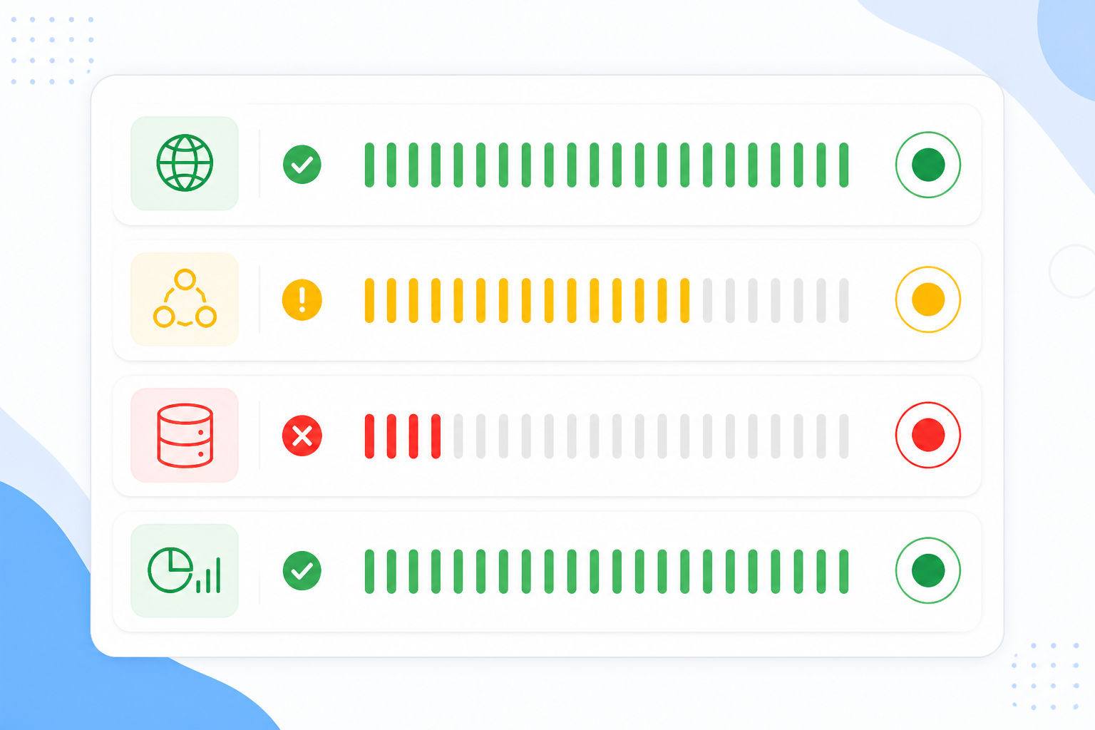
GitHub's status page is a great reference point for real-time status indicators done right. Instead of one blanket "GitHub is up" light, it breaks things down by component: GitHub.com, Actions, Packages, API Requests, Webhooks, so a developer can immediately tell whether their CI pipeline is affected or just the web dashboard.
What to copy: simple, colour-coded systems, green, amber, red, paired with plain-language labels: "Operational," "Degraded Performance," "Partial Outage," "Major Outage." Colour alone is ambiguous; amber means different things to different people until you spell it out. Breaking status down by component, rather than using one global indicator, matters enormously once you're running more than one service.
A limitation to note: even good component breakdowns can go stale if the underlying monitoring is slow to detect a real failure. That's exactly why Moonitor tracks HTTP/S, API, server, and DNS monitors as distinct entities rather than lumping everything into one health check, so your status page reflects what's actually happening, not a guess based on "well, the homepage loaded fine." One thing to avoid regardless of tool: ambiguous statuses like "Monitoring" with zero explanation. Monitoring what? For how long? If a status label doesn't answer "what does this mean for me," it's not doing its job.
2. Slack and GitHub: Historical Uptime and Incident Logs You Can Check
Here's a pattern that surprised me when I first started paying attention to it: the companies with the most trustworthy status pages weren't hiding their bad days. They were publishing them. Both Slack's status history and GitHub's history page maintain dedicated, timestamped incident logs separate from the current status view, so customers can verify claims rather than take a company's word for it.
What to copy:
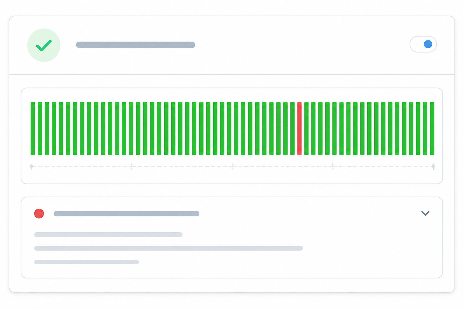
- Show 30, 60, or 90 days of history. A clean uptime record hidden away doesn't build trust. A visible one does, especially when it's paired with an honest record of the rough patches.
- Pair percentages with context. "99.97% uptime" means very little on its own. "One 12-minute API outage on 3 March, resolved by rolling back a deploy" tells a story customers can actually evaluate.
- Link resolution to root cause where possible. Even a short line like "caused by a misconfigured load balancer, since fixed" does more for credibility than a polished statement with no substance.
Worth remembering: 99.9% availability still allows for close to 9 hours of downtime a year. That's not a scandal, it's maths. What customers actually care about is whether you're straight with them about it. This is also where response-time analytics and incident history from your monitoring tool stop being internal-only dashboards and become genuinely public-facing proof of reliability.
3. Atlassian Statuspage: Subscriber Notifications Done Right
A status page that customers have to remember to check isn't much better than no status page at all. The Statuspage platform, which powers status pages for thousands of SaaS companies, built its reputation partly on making it easy for updates to come to you, on your terms: email, SMS, RSS, Slack, and webhook subscriptions, depending on the plan.
What to copy:
- Offer multiple lightweight channels where you can. An on-call engineer probably wants a webhook or Slack ping; a founder might just want email.
- Skip forced account creation. One-click subscribe (and unsubscribe) without a login wall removes friction at the exact moment someone's stressed about an outage.
- Match notifications to the incident lifecycle: opened, meaningfully updated, and resolved, not just once and then silence.
- Don't over-notify. Reserve alerts for customer-visible impact, or people will mute you and miss the ones that matter.
A caveat worth flagging: channel availability actually varies quite a bit by provider. Not every status page tool supports SMS, Discord, or Telegram natively, so check what your platform actually offers before promising it to customers. Inside Moonitor, we built real-time alerting via email, Slack, Discord, Telegram, and webhooks specifically so the right person gets pinged the moment something's wrong internally. The same lifecycle logic just needs to extend outward to your customer-facing subscribers too.
4. Cloudflare: Honest, Human Incident Updates
This is probably the pattern I feel most strongly about. There's a particular kind of corporate hedging that shows up during outages, "some users may be experiencing intermittent issues," when the team writing it already knows exactly how many users are affected and exactly what's broken. Customers can smell that from a mile away, and it erodes trust faster than the outage itself.
Cloudflare's public post-mortem for their 21 June 2022 outage is honestly worth reading as a model. They named the network configuration change that caused the failure, gave a timeline, and explained the fix. No spin, no deflection. It's the kind of write-up that makes you trust the next incident report more, not less.
Here's a template you can actually copy, labelled by incident stage:
- Initial update (within minutes): "We've confirmed the API is returning errors for a subset of requests affecting checkout. We're investigating and will update by [time]."
- Progress update: "We've identified the issue as a misconfigured load balancer rule deployed at 14:02 UTC. We're rolling back now. Next update in 30 minutes."
- Resolved update: "The rollback completed at 14:47 UTC and error rates have returned to normal. Root cause: a load balancer configuration change. We're adding a pre-deploy check to catch this before it ships again."
It's fine if an update is just "we still don't have a root cause, check back in 30 minutes." That's more trustworthy than silence dressed up as reassurance. And one thing that quietly protects this whole process: making sure an incident is real before you post about it. False alarms erode trust just as fast. Customers stop believing your status page if it cries wolf, which is exactly why confirming a failure from more than one region before triggering an alert keeps a status page credible instead of noisy.
5. Stripe: Custom Domains and Branded Status Page Design
Stripe's status page lives on its own domain, with Stripe's typography and visual identity carried straight through. It feels like a natural extension of the product rather than a bolt-on. A status page hosted on some generic third-party subdomain can feel like it doesn't quite belong to you, and worse, it can make wary customers wonder if it's even legitimate.
What to copy, provider-independent:
- Point a proper subdomain (
status.yourdomain.com) at your status page via DNS, with a valid TLS certificate. A status page without HTTPS looks worse than no status page at all. - Add a support link so people aren't stuck reading a status update with nowhere to go for help, plus a link back to your main site.
- Use a favicon and consistent visual identity, so the page doesn't look abandoned or, worse, like a phishing attempt.
- Check colour contrast for accessibility and confirm the layout holds up on mobile. A lot of outage traffic arrives from someone's phone, not their desk.
This is one of the reasons we built branded status pages with custom domain support directly into Moonitor, but the underlying checklist above applies whichever tool you use.

6. Zoom: Component Grouping for Complex Products
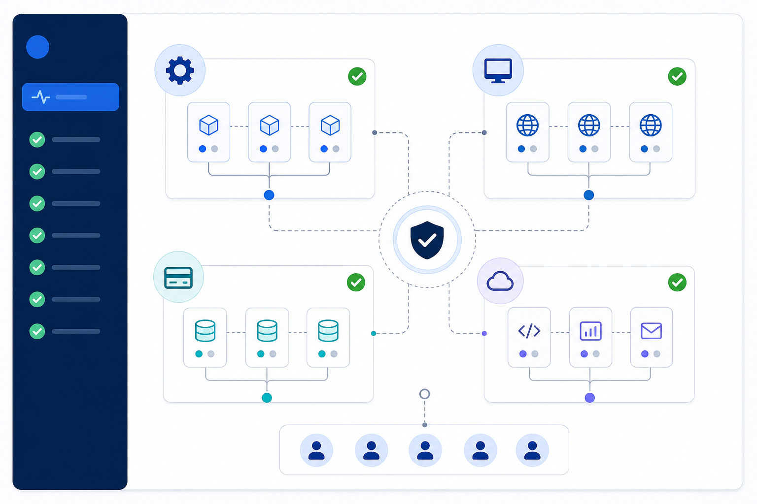
Zoom's status page groups its many products, Meetings, Webinars, Phone, Rooms, into logical categories rather than dumping everything into one flat list. Stripe does something similar for payments infrastructure, separating the API, dashboard, and webhooks because those actually fail independently.
The point is the same either way: grouping helps customers self-diagnose in seconds. "Oh, it's just Webinars, not my whole account" is a much calmer thought than staring at an undifferentiated wall of red. The trick is grouping by customer impact, not internal architecture. Nobody outside your engineering team needs to see "us-east-cluster-3," but they do need to know if checkout or billing is affected.
This maps naturally onto how monitoring already works: HTTP/S, port and ping, cron/heartbeat, and SSL monitors organised by what they actually protect, so your status page structure mirrors your real infrastructure map rather than an arbitrary list. Watch the other extreme too. Over-granularity overwhelms just as much as under-granularity. If customers need a legend to understand your status page, you've gone too far.
7. Basecamp: Scheduled Maintenance Transparency
Basecamp's status page has long kept a distinct, clearly-labelled maintenance log, separate from its incident history, so a planned change never gets mistaken for an outage. Unplanned incidents and scheduled maintenance should never look the same on your status page; mixing them causes unnecessary panic when someone sees "outage" and doesn't realise it was planned all along.
A few things that consistently build confidence here:
- Give advance notice, paired with expected duration. Forty-eight hours is a common starting point, but treat it as a floor, not a rule. Customers with stricter SLAs, or maintenance with real customer impact, may reasonably expect more.
- Explain why the maintenance is happening, even in a single sentence.
- Keep the maintenance log visually and structurally separate from the incident log.
A lot of "unplanned" downtime is actually entirely avoidable, and SSL and domain expiration are classic culprits. A certificate quietly expiring at 3am shouldn't be the reason your status page turns red. That's exactly the kind of thing SSL certificate monitoring and domain expiration monitoring should catch weeks ahead of time, turning a potential incident into a scheduled, boring, non-event.
How to Put These Status Page Patterns Into Practice
If you're starting from scratch, or trying to fix a status page that's been quietly neglected, here's the order I'd tackle this in:
- Audit your current page (or lack of one) against the seven examples above. Be honest about where it falls short.
- Map your actual infrastructure, websites, APIs, servers, cron jobs, DNS records, so your status page components reflect real monitors, not guesses about what might be running.
- Set up uptime monitoring and incident alerting first. Your status page is only as trustworthy as the data feeding it, and no amount of good copywriting fixes bad data underneath.
- Choose a status page tool that supports custom domains and branding, so the page feels native to your product instead of tacked on. If you're weighing options, Moonitor's branded status pages are one route, but Statuspage and others cover similar ground. Pick based on what your stack actually needs.
- Write your incident update templates now, using the three-stage structure above, before you need them during a real outage.
- If you're a UK-based SaaS handling personal data, keep incident descriptions factual and coordinate with anyone handling data protection obligations before publishing anything that touches a security incident. A status page update and a regulatory disclosure serve different purposes, but they need to say the same true thing.
FAQ: Building a Trustworthy Status Page
What makes a status page actually build trust, not just look professional?
Trust comes from specificity and consistency, not polish. A trustworthy status page shows real-time status broken down by component, keeps an honest historical record of past incidents (including the bad ones), and writes updates in plain language that admits what's known and unknown. A beautifully designed page that's vague or slow to update will always feel less trustworthy than a plain one that's accurate and fast.
Should I show historical uptime data publicly, even if it's not perfect?
Yes, and it often helps more than it hurts. Customers generally assume some downtime happens; what erodes trust is discovering an outage you didn't mention. A public incident log with timestamps and short explanations shows you're not hiding anything, and a 99.9% uptime figure with context feels far more credible than a suspiciously spotless record with no history at all.
How do I let customers subscribe to status updates without adding friction?
Offer multiple lightweight options where your provider supports them, email, RSS, Slack, or webhook, and skip account creation entirely if you can. The subscription should follow the incident lifecycle automatically, sending an update when an incident opens, when it changes, and when it resolves, so customers aren't left checking manually or getting a single alert with no follow-up.
Which companies have status pages actually worth studying?
GitHub for component-level real-time status, Slack for accessible incident history, Atlassian's Statuspage for flexible subscriber notifications, Cloudflare for genuinely honest incident write-ups, Stripe for branded custom-domain design, Zoom for sensible component grouping, and Basecamp for keeping scheduled maintenance clearly separate from real incidents. None of them get everything right, but each one demonstrates at least one pattern worth copying directly.